New and Old:
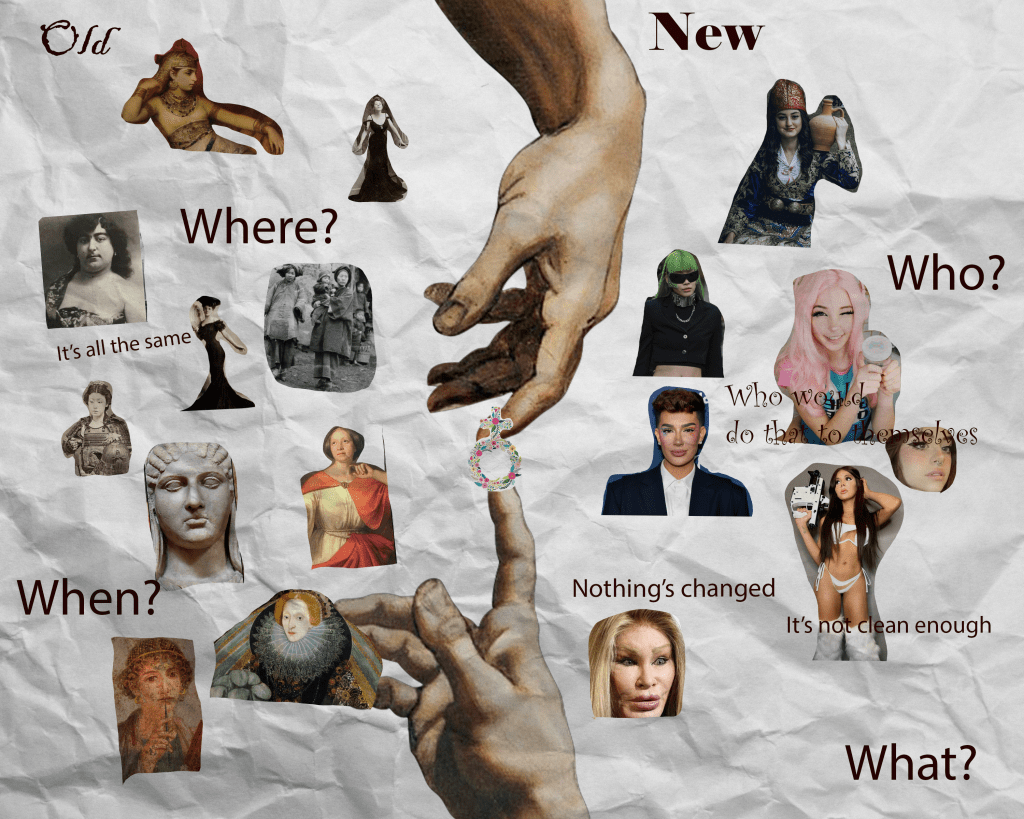
My Photoshop project is a collage style piece inspired by Dadaism. The image shows the famous scene of God and Man almost touching hands, running vertically down the middle. The background looks like crumpled paper, which gives it a rough, real texture that contrasts with the smooth portraits on each side.
This piece is a collage about the old and new definitions of attractiveness. I put the female symbol in the middle as a symbol that attractiveness and beauty has always been in the court of women and how men judge them. I also included different beauty standards that cause damage or harm. There are also some general conventions of beauty that exist here as well.
I was inspired by Dadaism’s collage style that mixes all kinds of images to make you think differently. The mix of old and new, divine and human, tradition and modern life is supposed to make you stop and think about how these ideas stick around and change.
The crumpled paper background is from a scanned piece of real paper I edited to fit the image. I wanted the whole piece to feel dynamic but still a bit rough around the edges to match the complicated theme.
In short, this work talks about how ideas about beauty and attraction move through time, shaped by history, society, and gender. It fits the course theme by showing how culture can shift and hold onto old ideas at the same time.
Place and Displacement:
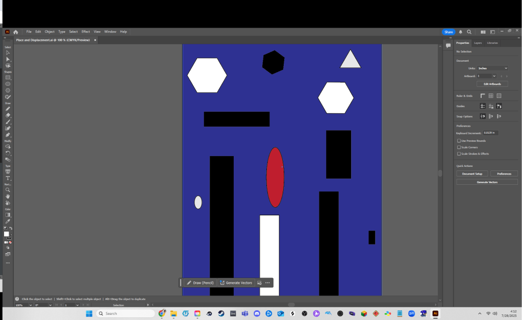
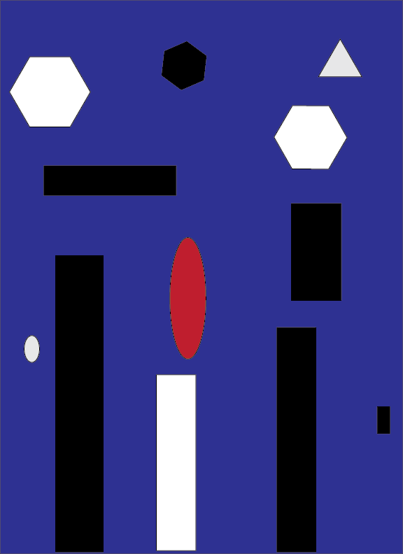
So for my Illustrator project, I made this abstract image called Red is Alone Again. The background is this deep purple color, kind of muted and dark, and I added a bunch of geometric shapes scattered around it. I wanted something that drew your eyes toward the center of the piece. I also wanted it to give a sense of isolation.
I used the Element of Art called Value here. The purple background contrasts with the red circle that’s just square dead center. The other shapes are very bland, being only black and white. I did this to give a sense of distance from the red circle. It’s open to interpretation but I liked the idea of it being more than a visual identity issue. Maybe someone has a mental disorder they can’t talk about, or a personal issue that they’re dealing with at home. Maybe they have dark thoughts about living, the circle is that person who feels out from the crowd.
This idea was inspired by Yto Barrada. Barrada is known for using abstract imagery that’s mainly geometric to convey a unique concept that tends to have a ton of energy and movement. I wanted to do something akin to this, with just a lot less talent.
At the end of the day, the image is about the tension between standing out and feeling isolated. It ties into the class theme of Place and Displacement. How sometimes you can be physically surrounded by people but still feel emotionally separate.